This is the second post of the SharePoint Spaces series that I intend to write as I explore the options available for creating spaces. In this article, I will cover the different types of SharePoint Spaces structures currently available.
SharePoint Spaces series
- Part 1 – Easily enable SharePoint spaces
- Part 2 – SharePoint Spaces structures
SharePoint Spaces structures
There are two ways to create a SharePoint Space: via the home page command bar “New” button, or via the pages library “New” button. The Structure selector panel is only displayed when creating the Space via the home page command bar, so I recommend this option.
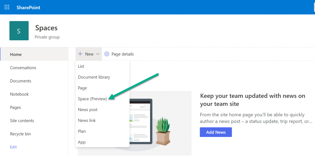
After selecting the option to create a Space (from the home page command bar), the Structure selector panel is displayed
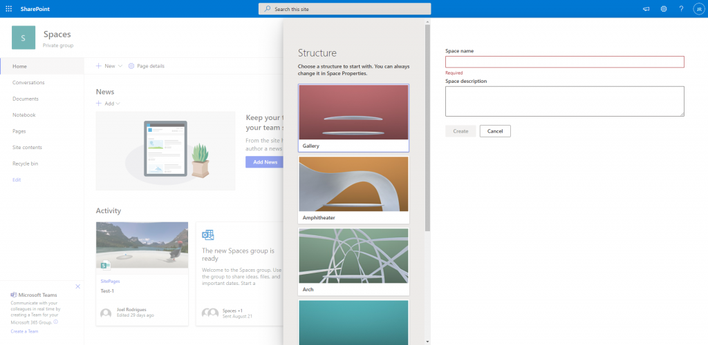
Let’s explore each of the different structures available.
Gallery

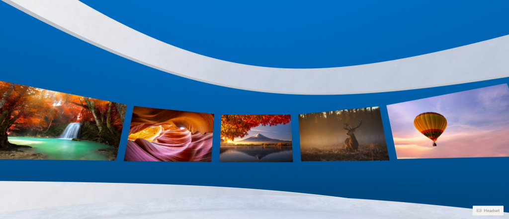
Like the thumbnail image suggests, the gallery gives you a space that is confined by a top delimiter. You have a 360 environment that is delimited by a “platform” at the bottom and a second delimiter at the top that limits the view. When the view position is vertically centred, you can see parts of both delimiters.
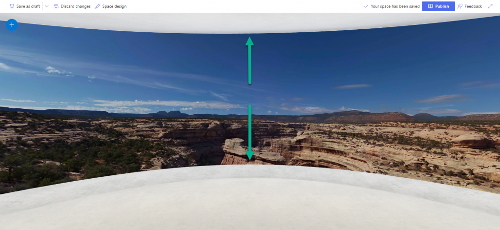
This structure can be used, for example, when creating a space where you expect users to move horizontally to consume the content.
Amphitheatre

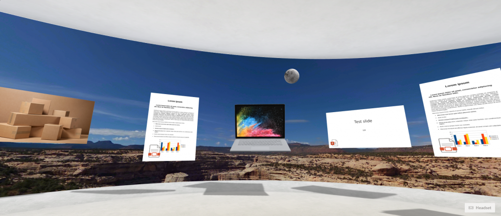
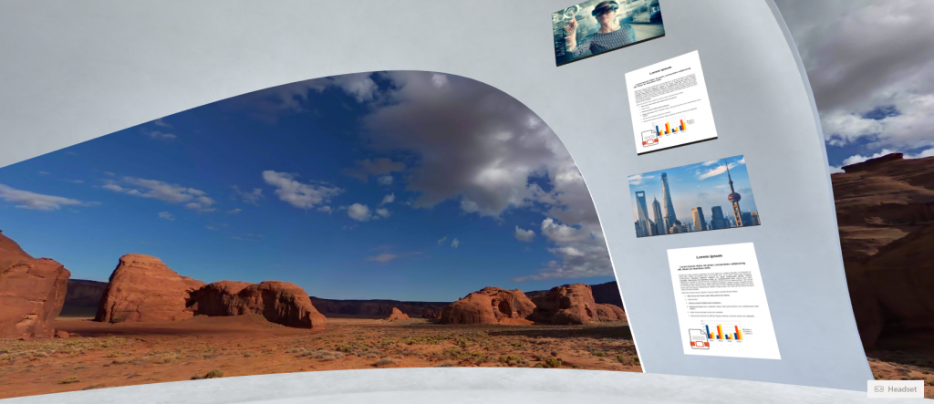
Using the Amphitheatre structure, we get what looks like an oddly shaped form that goes over the bottom platform. Personally, I think this makes a great location for our content.
Arch

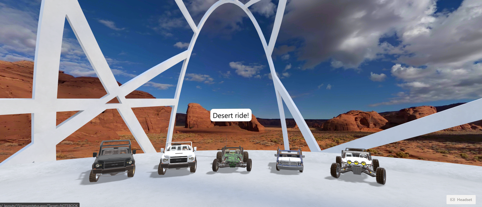
An arch-shaped irregular structure placed above the bottom platform. I think that this option is great when you want something generic and irregular to be placed between your background image and your content. The structure is not very intrusive and should not distract users from the real content.

Terrace

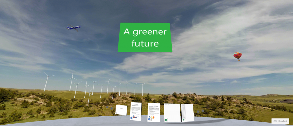
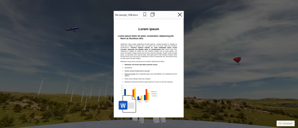
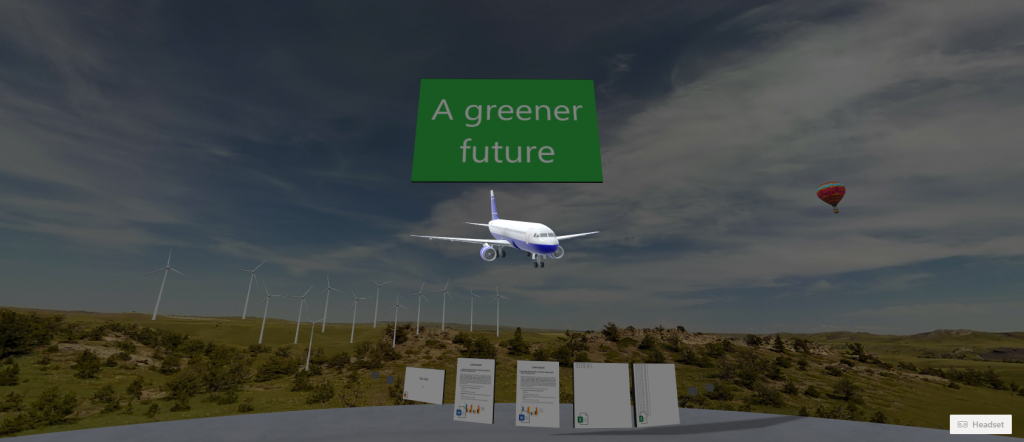
Likely the most common structure type for SharePoint Spaces. “The sky is the limit” for the terrace structure as there is no upper limit/objects and the space feels very open and wide. It basically consists of the bottom centre platform and the background texture, allowing content to be placed anywhere in the space.
Geodome

A partial, dome-like, irregular structure arranged as a set of polygons. The structure covers only a small part of the space, allowing the background image to remain relevant.
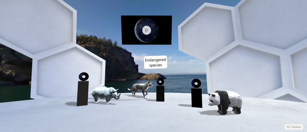
Spiral

As the name suggests, a spiral structure that starts from the bottom platform and follows a spiral course to the top. The spiral structure can also be used as a guide to place content that follows the spiral shape.


Is there any way to customize or create your own custom structure space or edit the ones provided out of the box?
Not that I am aware of, I’m afraid. Customisations are very limited at this point
What is the max “distance” from the platform in the structure? I’m using my company’s set up, and it appears the max distance is “20” so I can’t place things a further distance out than this. Is this the true max or is a max distance in structures configured by an administrator?
Hi, as far as I am aware there is no option to configure that as an admin.